UX / UI / eCommerce

Protec International

Presenting a regional brand as an international leader

Protec is the UK’s leading manufacturer and suppler of protection materials for the construction industry.

We were invited to evolve the brand identity to speak to a broader customer base as well as the trade core business.

Working closely with the Protec management and customer service team, we engaged with focus groups with returning customers to develop a visual and strategic plan to enhance and delight the customers.

It's all in the detail.

Emphasis was tuned to detail and excitement around the products, looking at the expanding US market for inspiration.

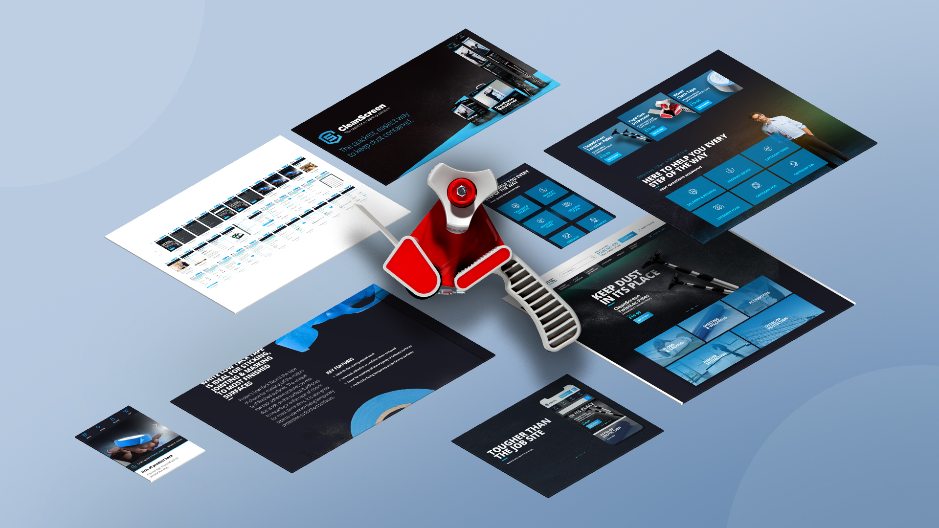
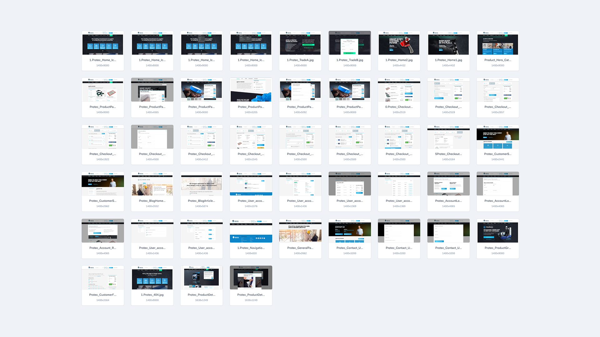
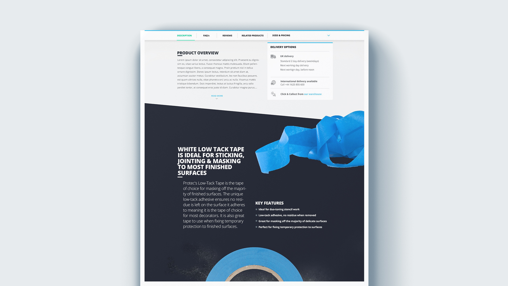
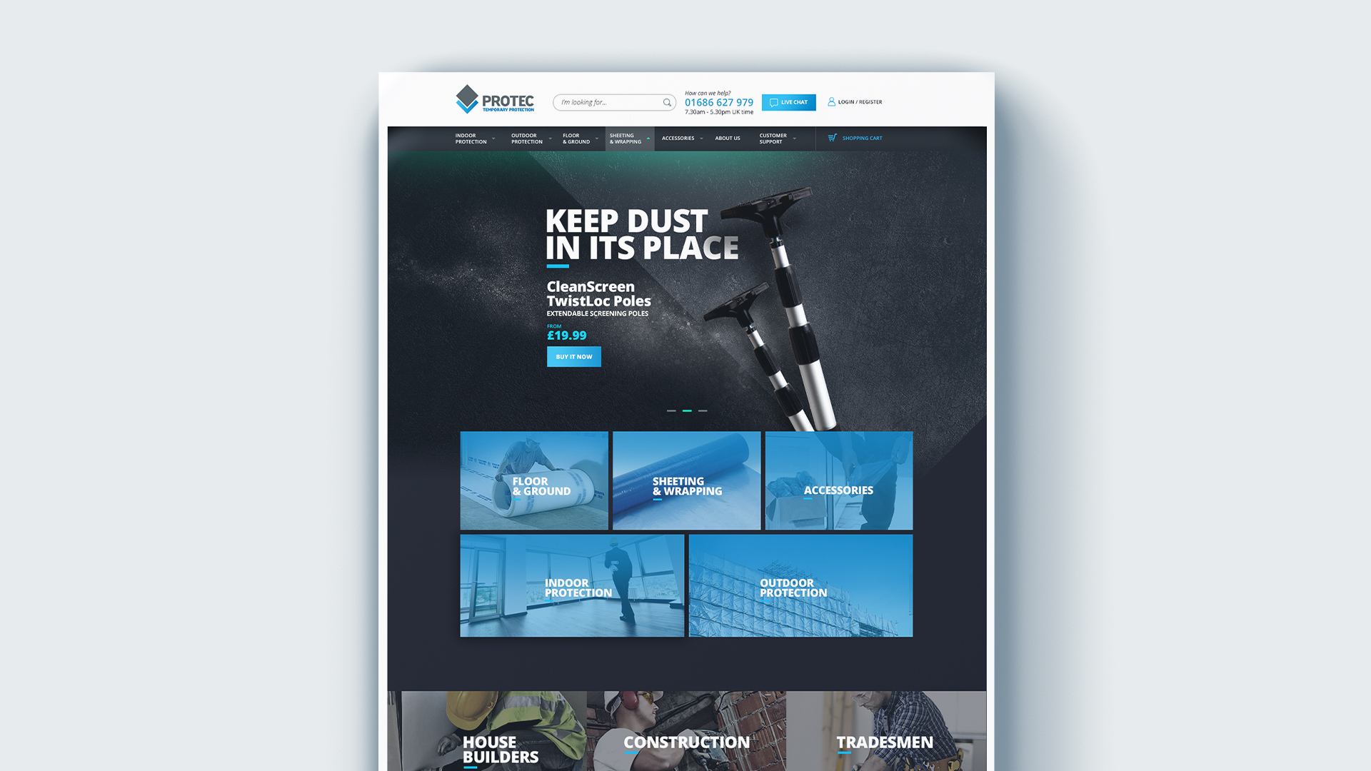
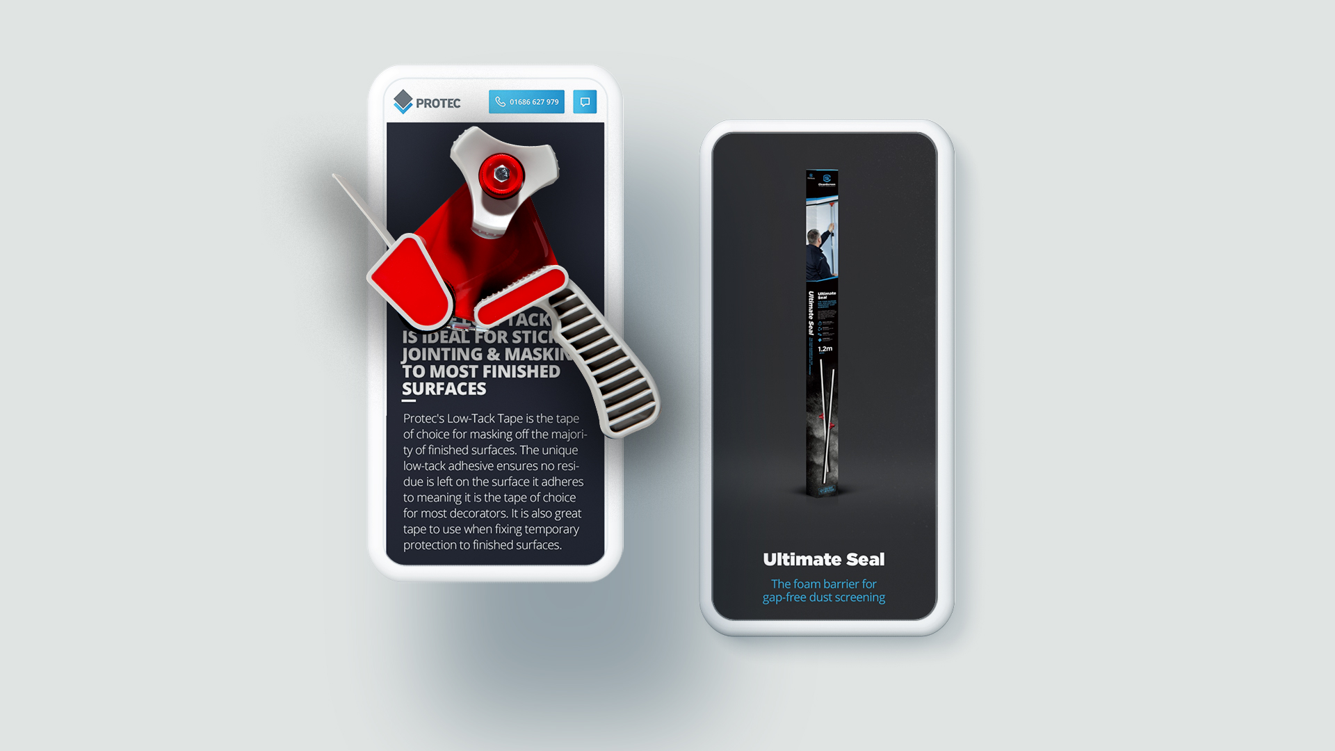
Our goal with the website was to provide informative content in an approachable and friendly wrapper. A simple content plan leads users to heightened product detail focussing on cross-sell, customer service and purchase options unseen in a standard e-commerce environment.

A brand strategy to create synergy.

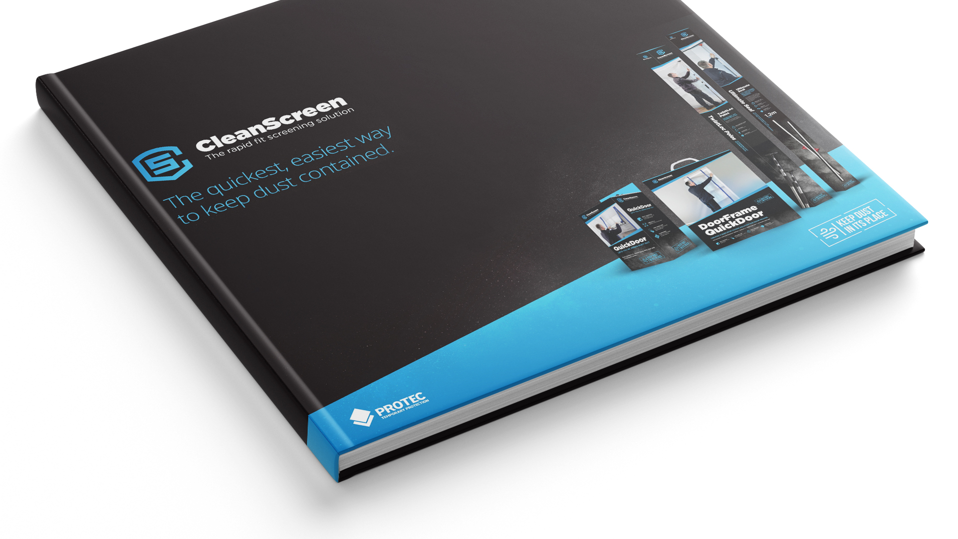
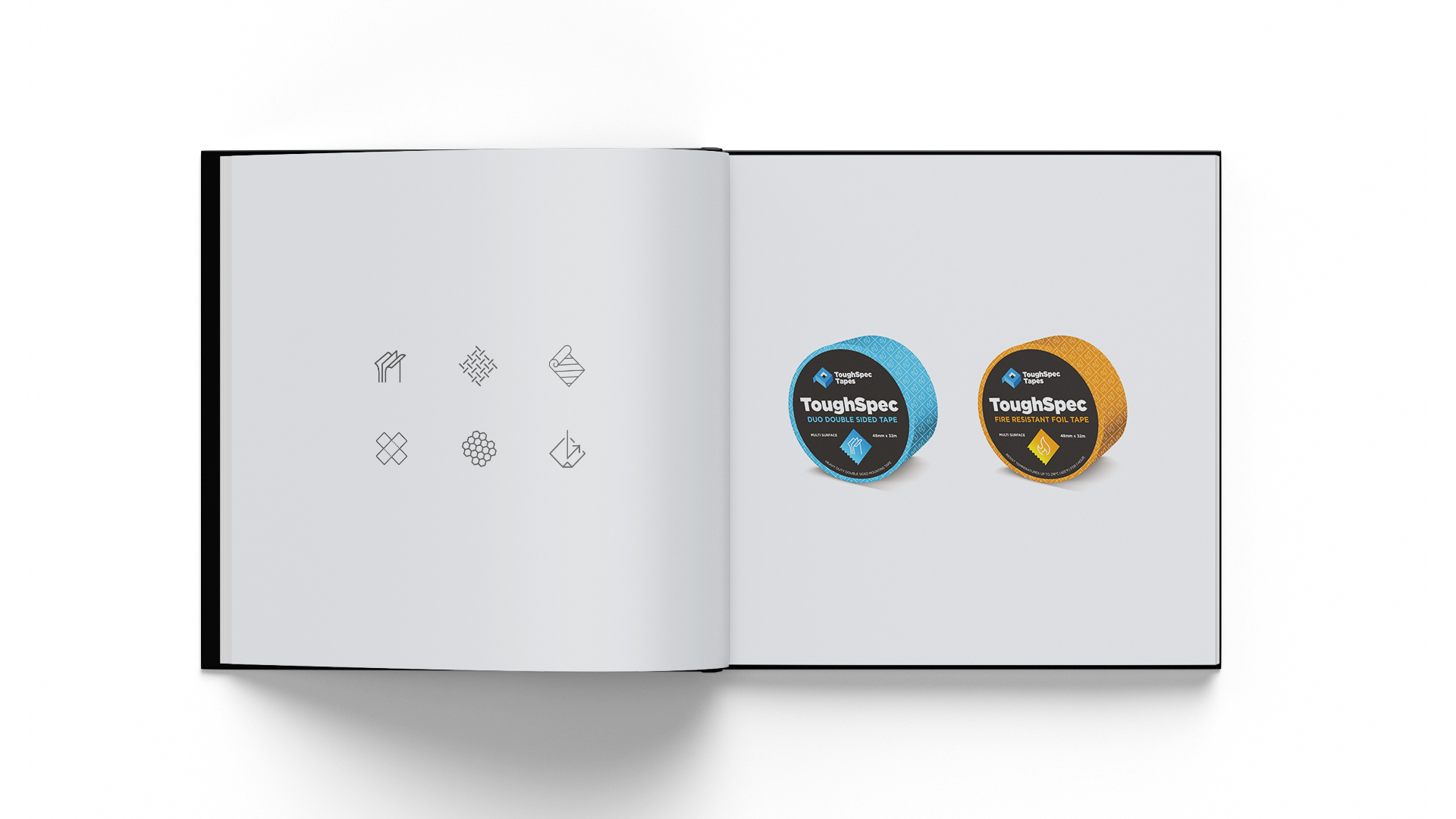
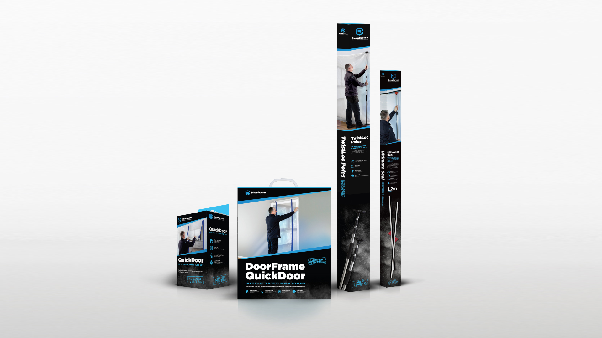
Protec’s previous packaging lacked visual consistency. It looked dated, with little in the way of differentiation between range categories or information on flexibility of use. This meant that customers were unclear as to the purpose of the products, which in turn meant that there was little perceived value in the Protec brand. We needed to make all Protec products stand out on the shelf.

Styling.

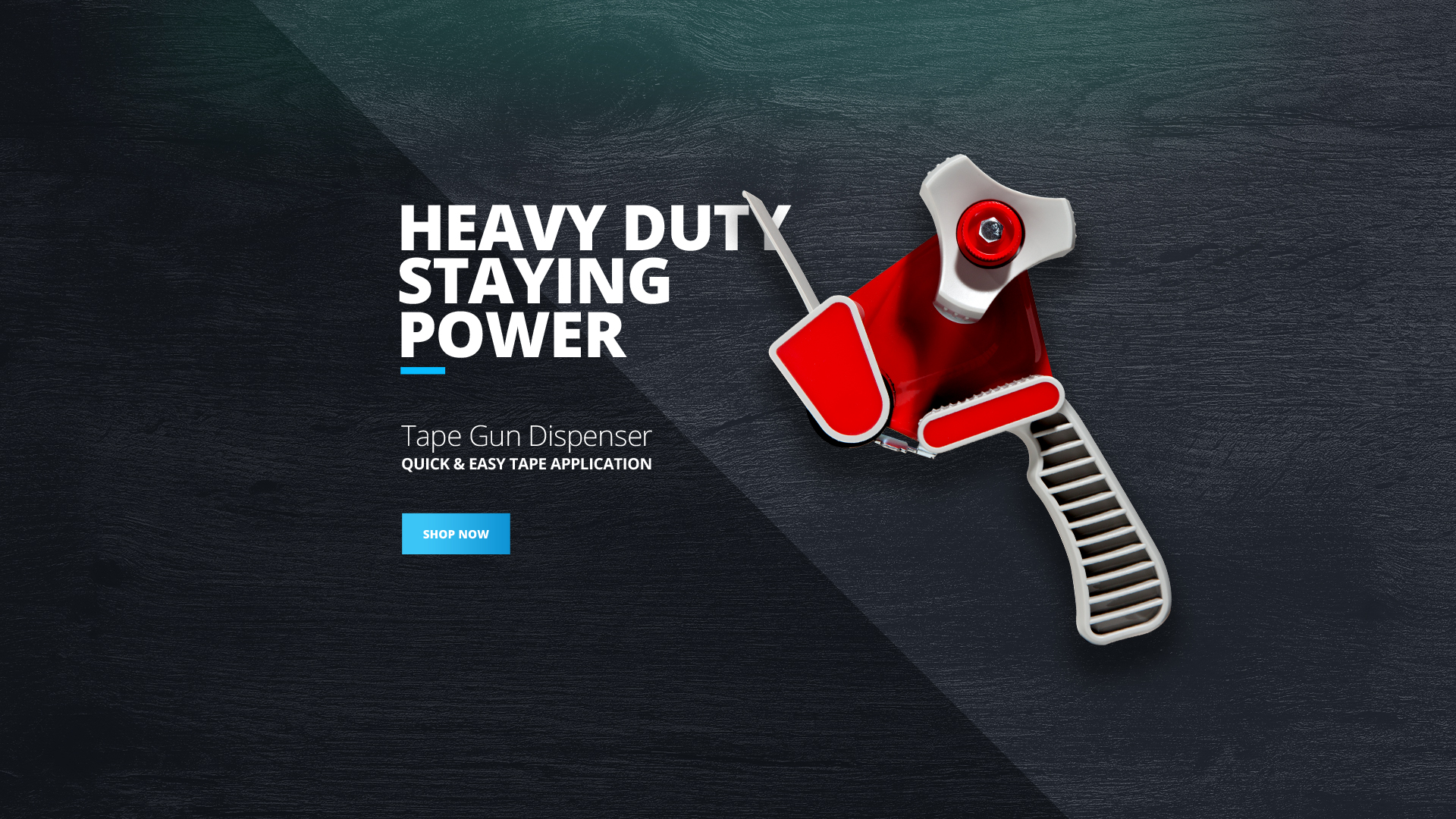
Our use of mixed media, photographic manipulation, lighting effects and composition and interaction with the product gives an overall impression of industry, strength and versatility.

A consistent approach throughout.

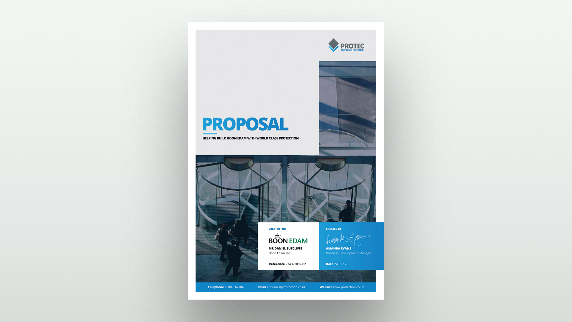
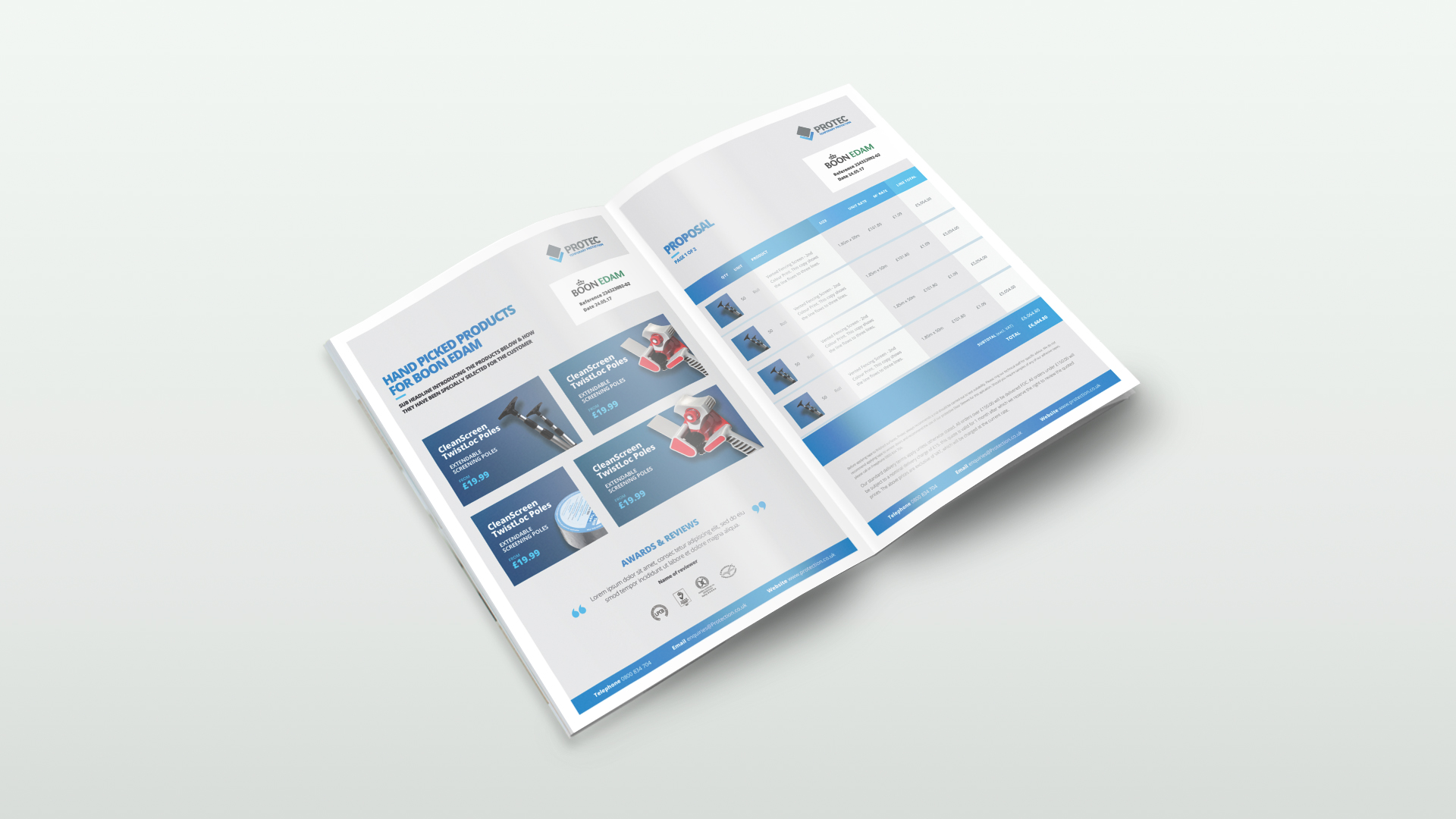
The new creative aesthetic was carried through to every single touchpoint within Protec’s Brand Atmosphere, including all of the products in their various ranges, invoices, proposals, as well as on the brand’s fully responsive website and social media profiles.

Ready to start a project?

If you’re ready to see how we can help your business achieve it’s goals, get in touch to start a conversation. Whatever stage you’re at, we’re here to help.

What our clients are saying

We love the simplicity, We now have the go-to app for flights.

Craig MacKay / Head of Marketing / Netflights.

We’ve done this together, you’ve really helped us create a great National brand & website. Thank you!

Reg Rix / CEO / CarFinance 247

180South exceeded Kirona’s expectations. Where Kirona faced design challenges, 180South presented clean and highly effective solutions

Jamie Heaton / Marketing Manager / Kirona
Next project